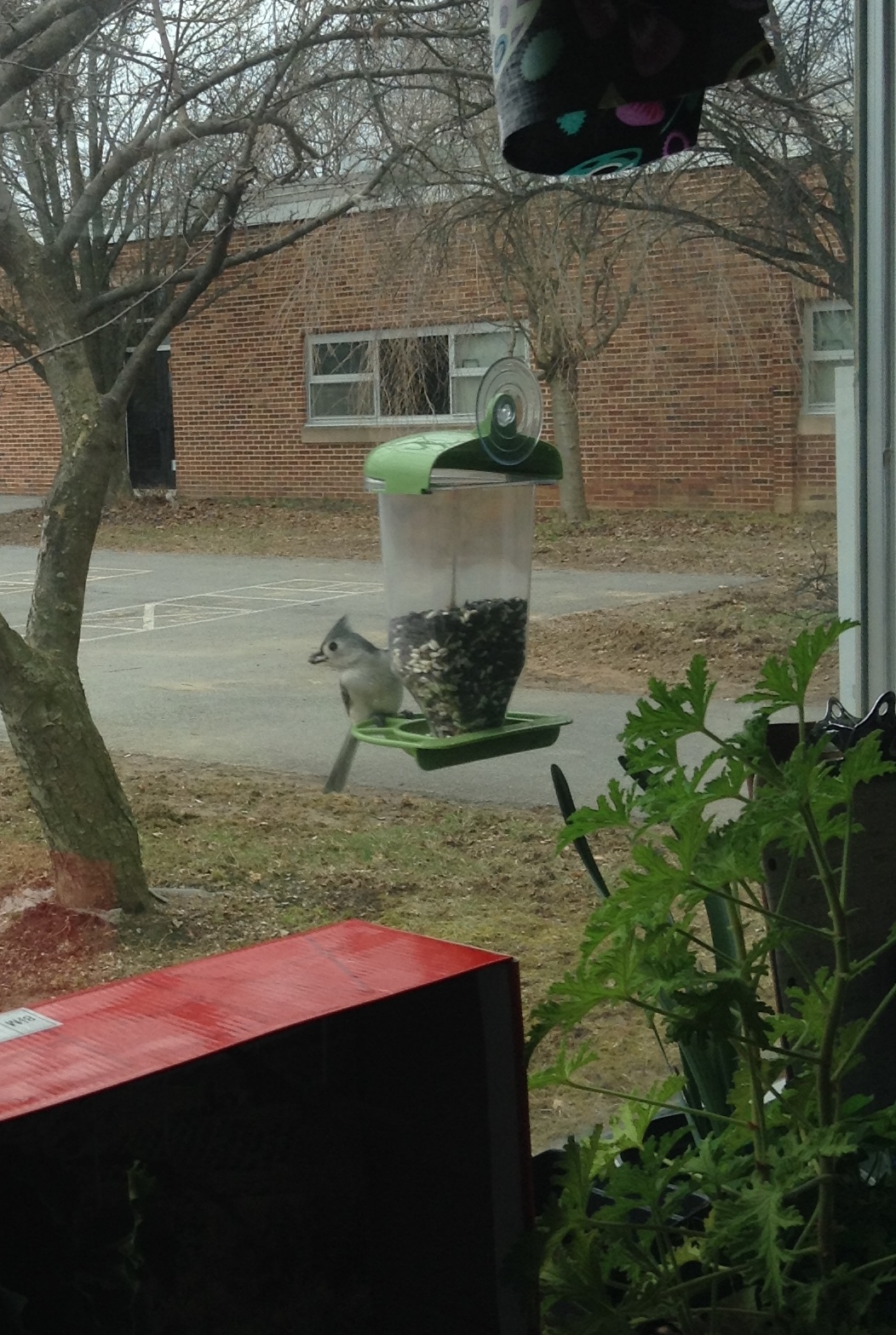
 In science class, we looked at bird feeder data from the past two years. In groups, students worked to organize the data and draw conclusions. This was a hard task...the data is sometimes incomplete, hard to read, and tough to organize.
Creating a graph is a great way to show data. You can find an easy-to-use graph creation tool here:
Create A Graph
If you are interested in learning more about birds, you may want to visit the bird cam from Cornell:
Bird Cam
What kind of data chart would you like to see us use over the next year? What kind of bird feeder data should we collect?
No comments:
Post a Comment